Brand identity · Art direction
Hype
A concept visual system for an urban mobility brand, turning every journey into a more visible, flexible experience connected with the city.
Academic concept project. Hype does not represent an operating company or commercial launch.
- Publication
- Behance · March 2022
- Context
- Master’s in Art Direction · Trazos
- Discipline
- Visual identity · Brand book
- Deliverables
- Logo · Motion · Applications
Mobility without an institutional tone
A brand for choosing how to move, not just how to get there.
Hype began as a concept brand capable of bringing different forms of urban mobility into one experience. The aim was to build a recognisable language spanning scooters and microcars, streets and interfaces, rather than designing a single vehicle.
Against the sector’s familiar technical or institutional tone, the proposition seeks a more active relationship with the city: movement, energy, choice and discovery. The identity needed to be visible, direct and flexible enough for different journeys, services and media.
This approach was developed for the Master’s in Art Direction at Trazos in Madrid and took shape in a complete brand manual.
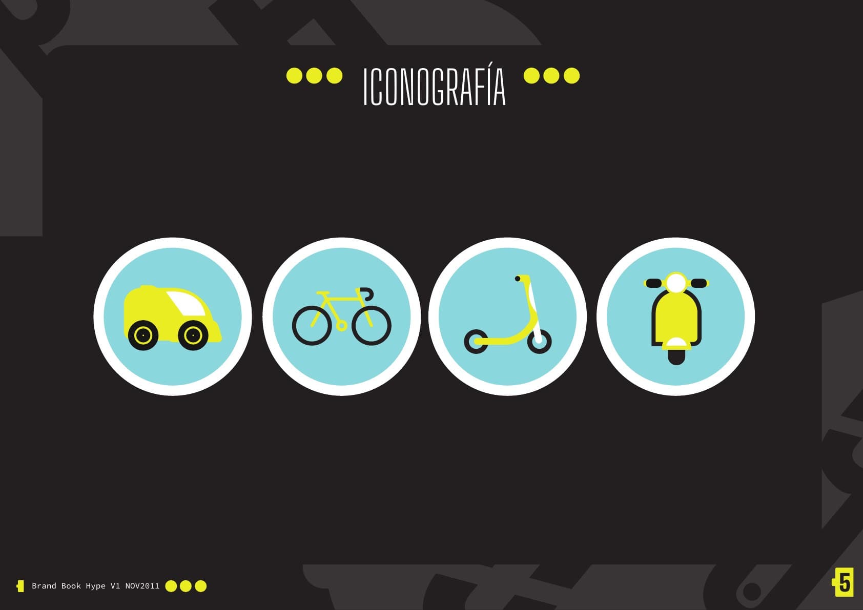
- 01
Coche
- 02
Bicicleta
- 03
Patinete
- 04
Moto
An identity that can move
“A mobility brand also needs to know how to move.”
The challenge was to unite a multimodal offer without turning the brand into a collection of unrelated icons. Hype needed to be recognised quickly on a vehicle, app, urban sign or communication piece.
The system had to retain personality at very different scales while organising categories, routes and calls to action. The identity had to behave as part of the service itself, rather than remain static.
The city as a circuit
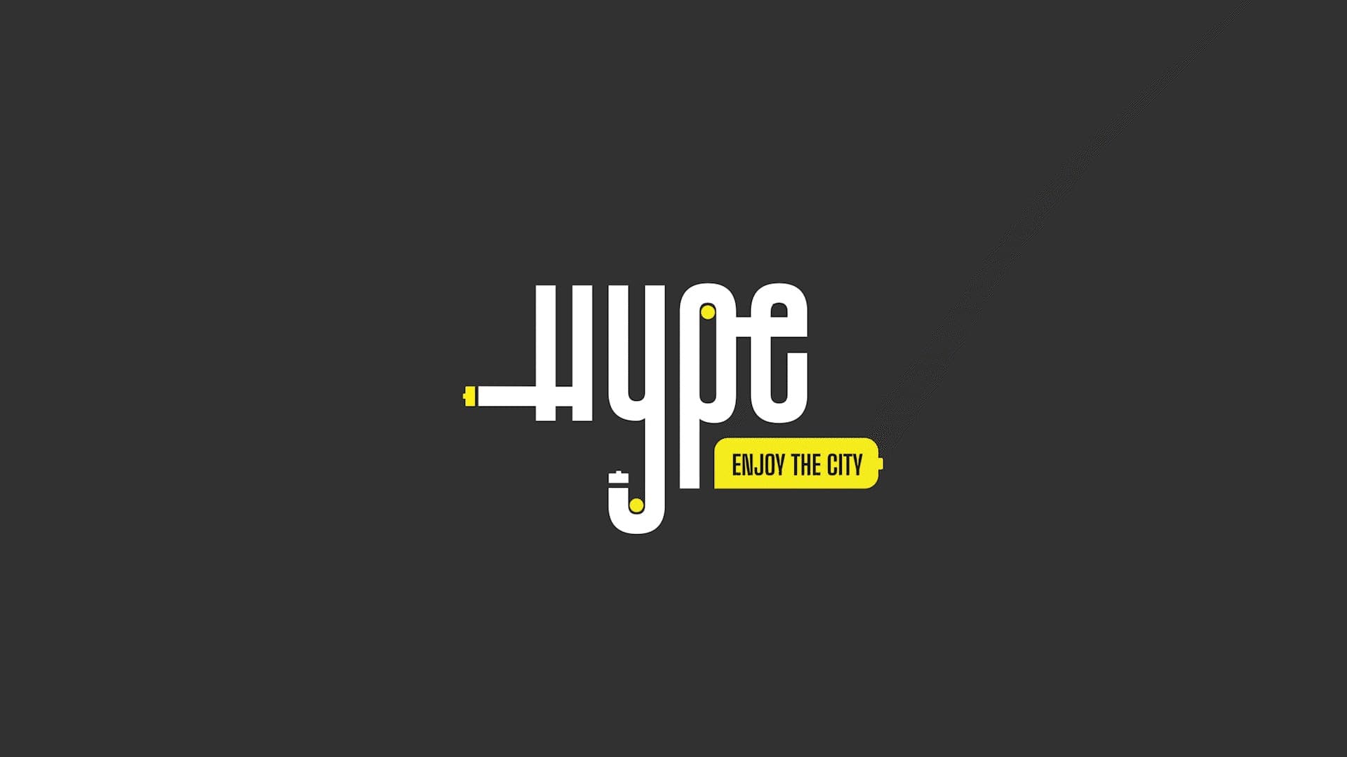
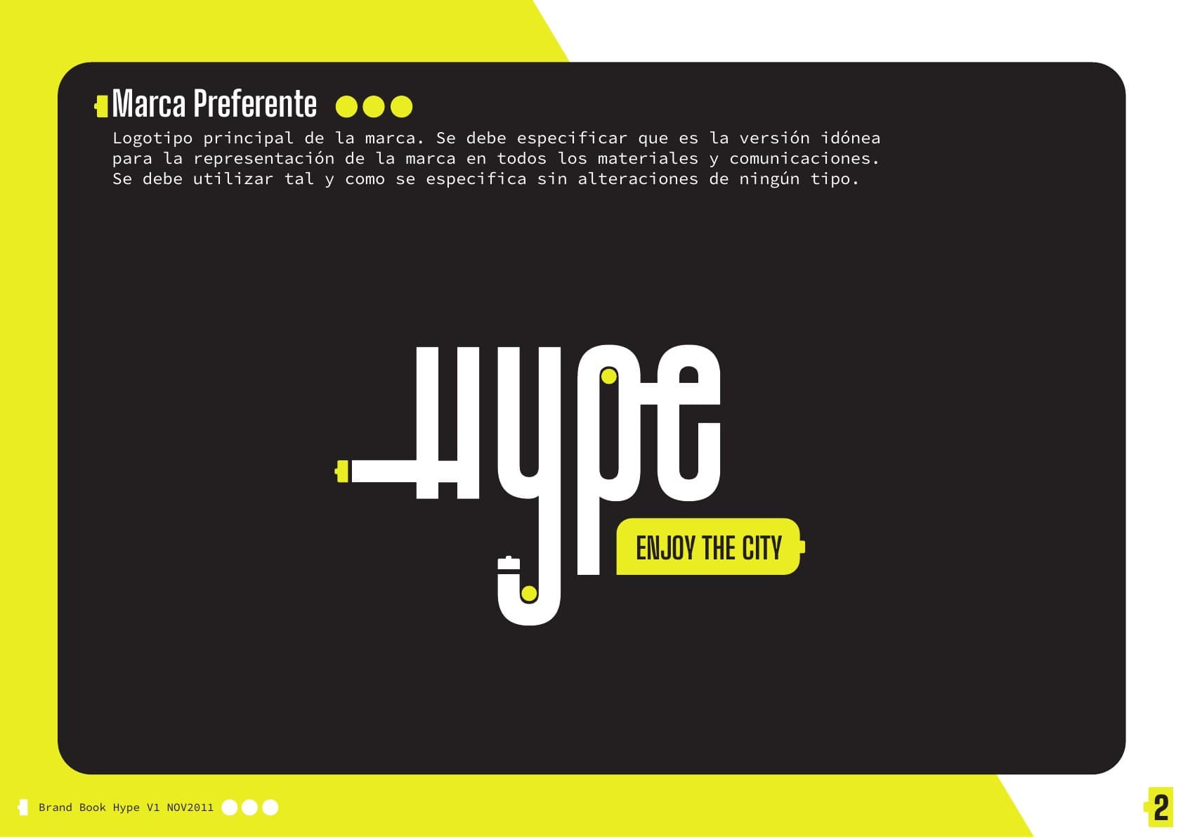
The graphic concept starts from a simple connection: moving means drawing a line between two points. The cable and plug turn that idea into a visual gesture that runs through the logo, draws routes and activates the brand.
The wordmark combines a condensed, vertical construction with terminals reminiscent of an electrical socket. The animation brings that logic into motion: the cable arrives, connects and lights up Hype.
“Enjoy the city” sums up the system’s attitude. Mobility becomes a way to travel, play and discover the surroundings, beyond its functional purpose.
The line connects
Enjoy
the city
Cable, route and energy share a single visual gesture.
High visibility, low friction
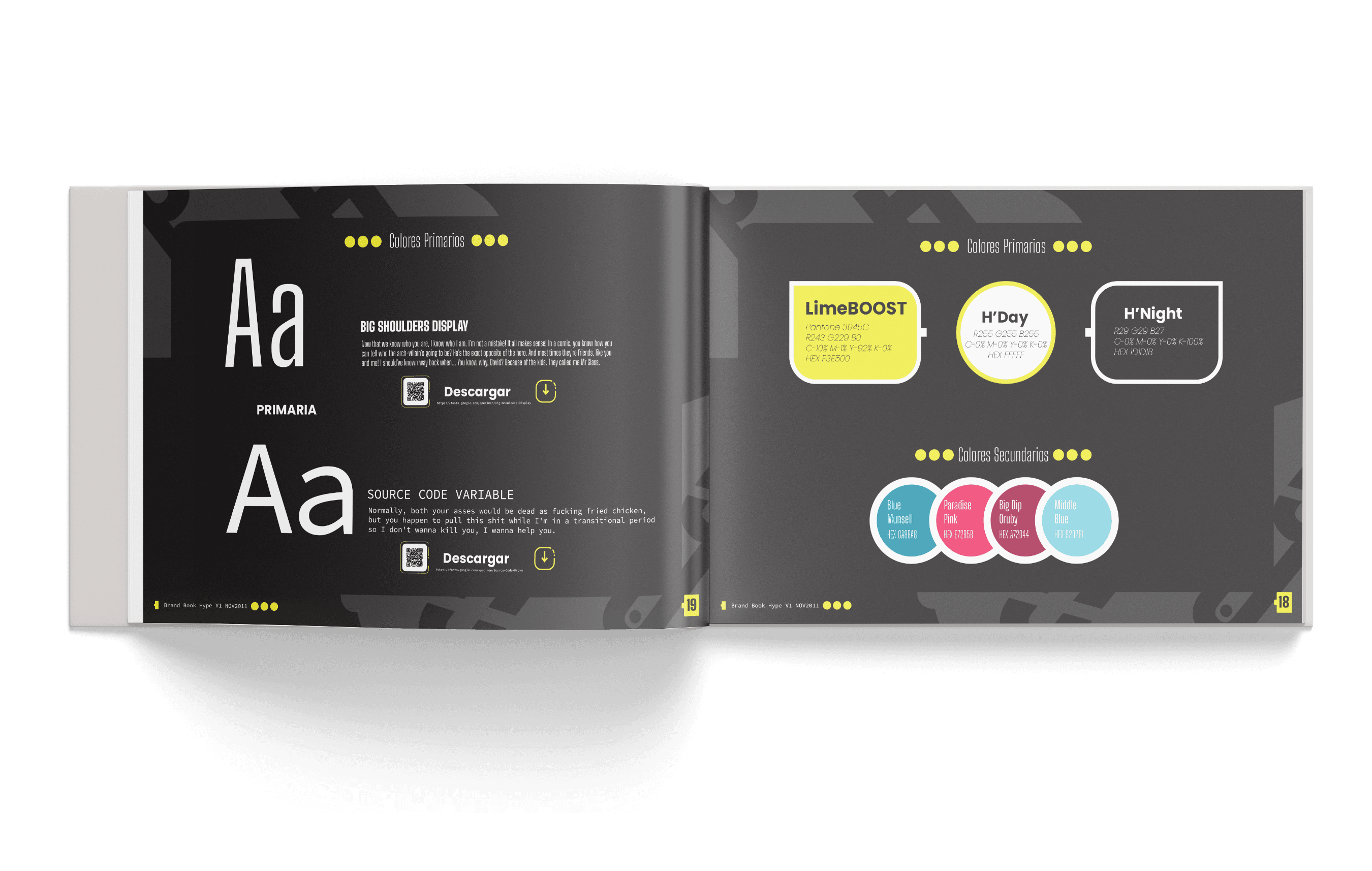
The contrast between electric lime and anthracite creates an immediate signature with a strong urban presence. White and secondary colours extend the system to distinguish services and provide guidance without diluting the brand.
Big Shoulders Display gives headlines a condensed, bold character. Source Code Variable provides a functional voice for data, instructions and digital environments.
Pictograms, routes, points and arrows form a shared grammar connecting signage, vehicles, advertising and interfaces.
Headlines
Move
Big Shoulders Display
Information
Route 01
MAD → CITY
Source Code Pro
From vehicle to interface
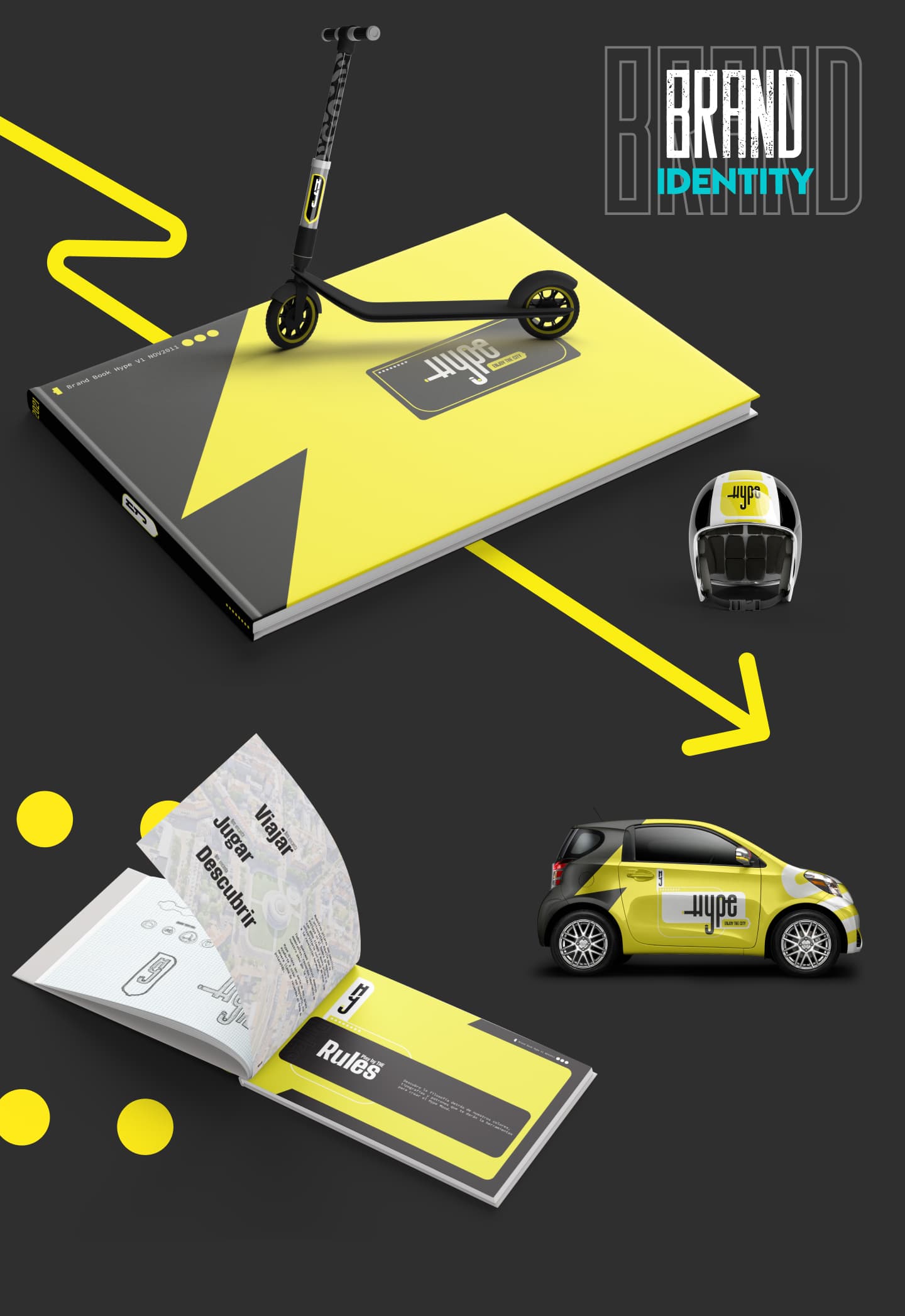
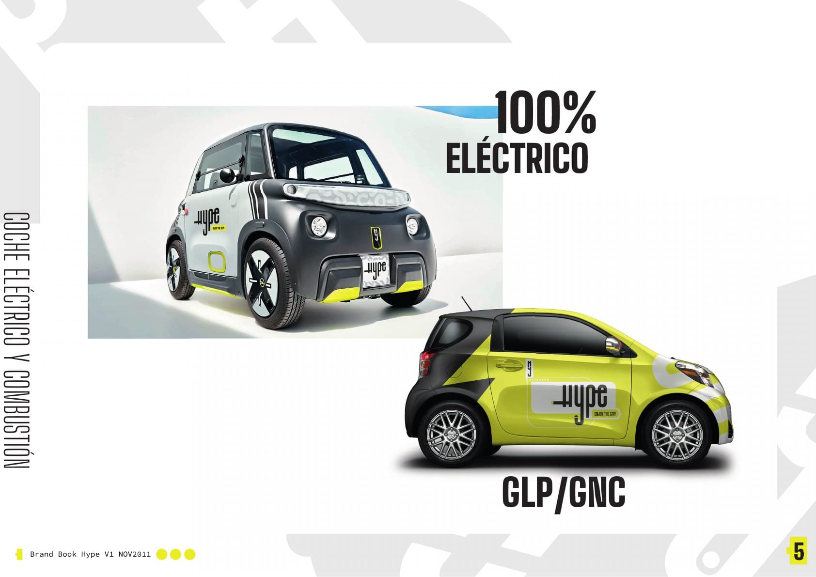
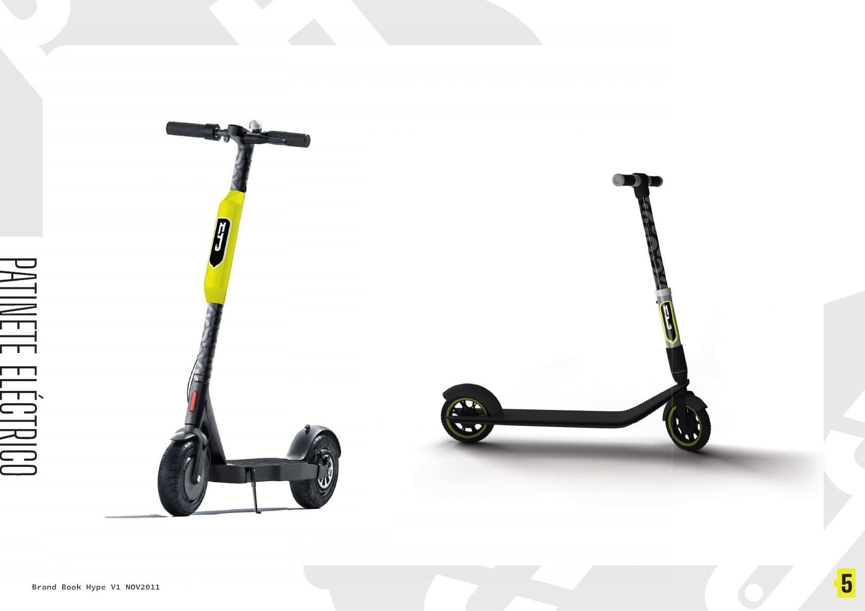
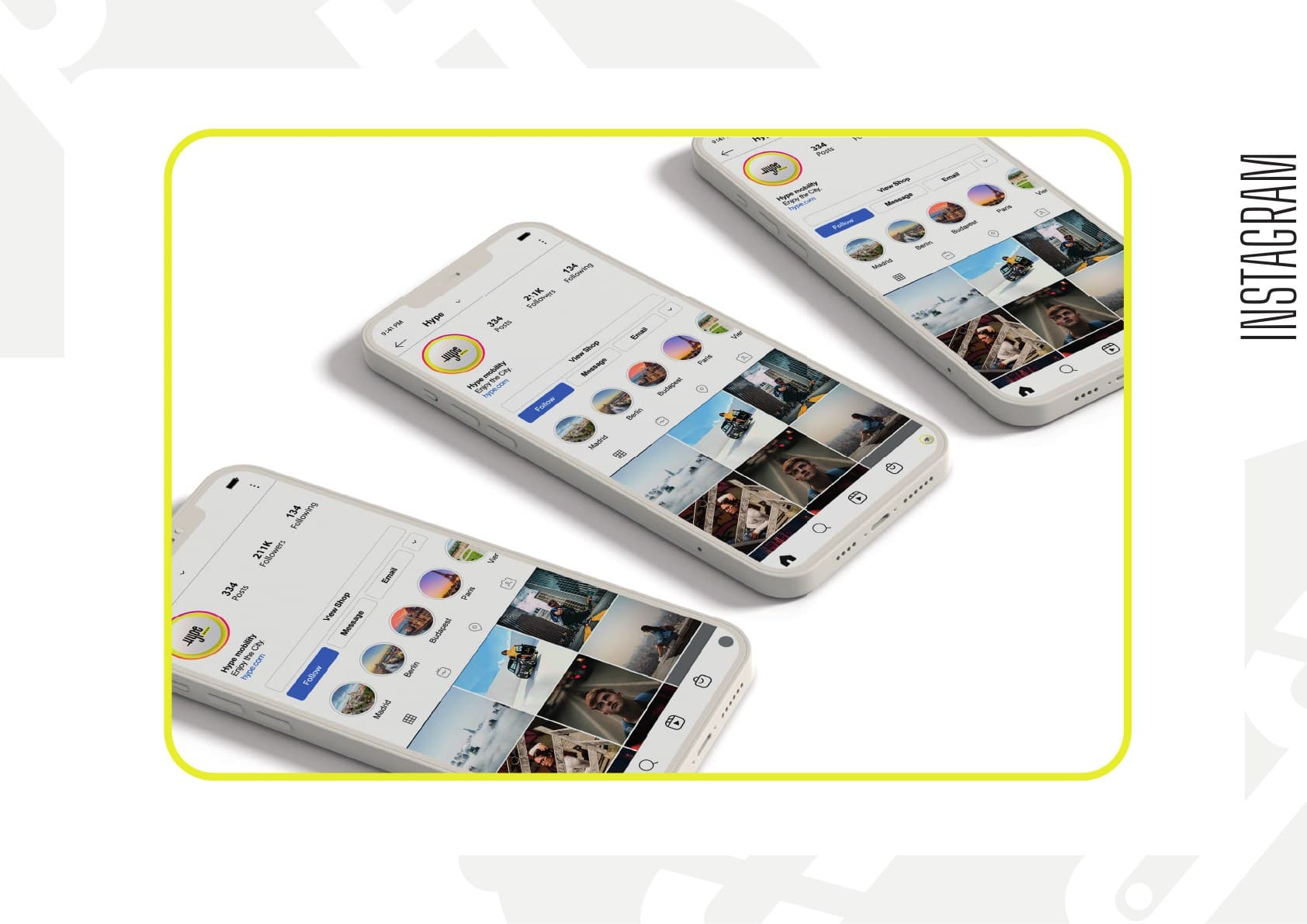
The manual tests the system across its main touchpoints: scooter, helmet, microcar, advertising, website, app and social media.
The same graphic logic holds as the scale changes. Colour identifies, the line guides, and modular resources let the identity adapt to physical and digital media.
The proposition demonstrates that the concept can become a coherent, usable system; it does not simulate market results.
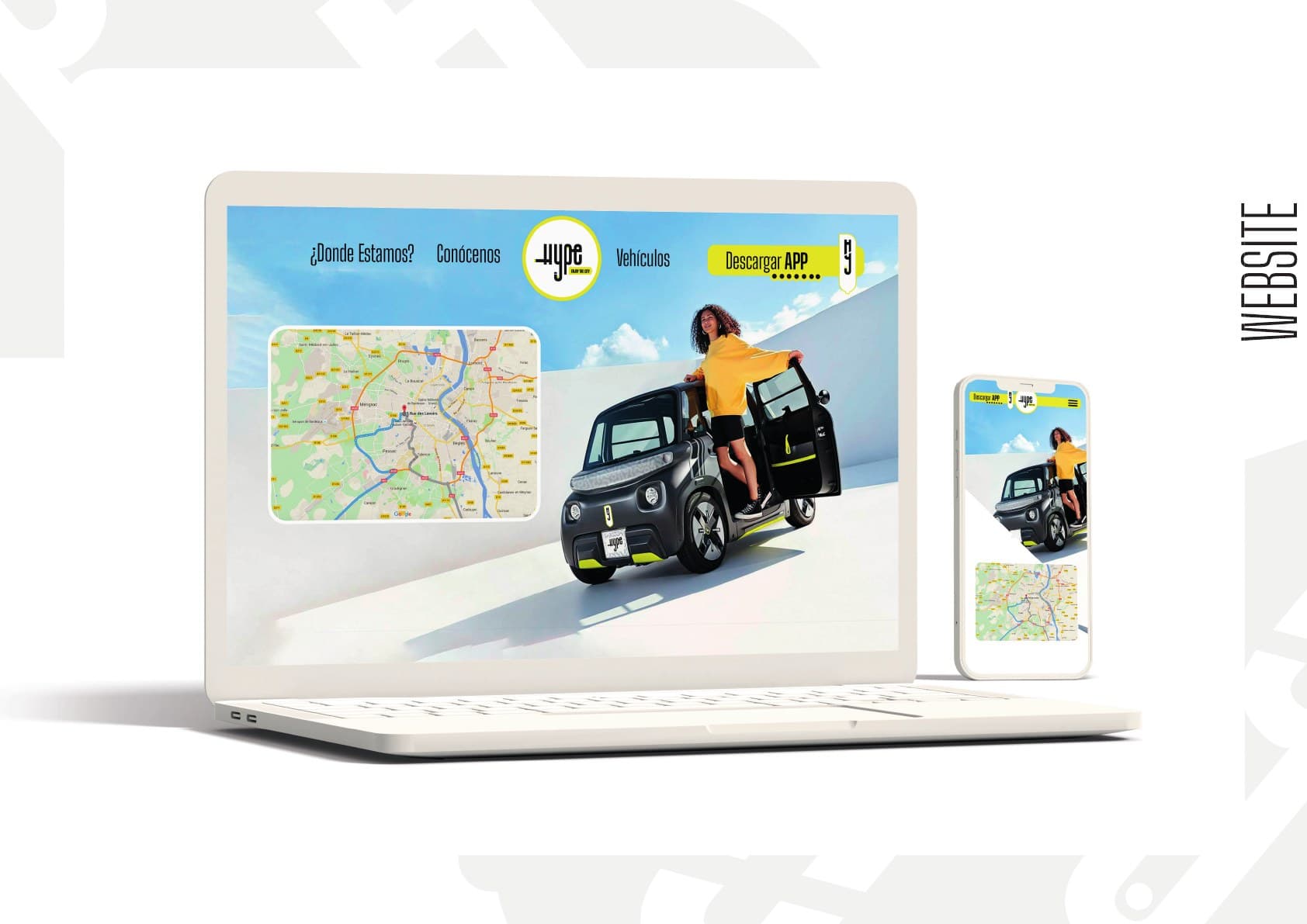
A concept turned into a system
Hype culminates in a brand book connecting visual strategy, usage guidelines and applications. The project’s value is in showing the whole journey: from an idea — the city as a circuit — to an identity that can live in motion.
The outcome demonstrates art direction and systems thinking in an academic context, without presenting it as a commercial case study.
- A recognisable concept
- The plug, cable and route build an original visual idea.
- A multimodal system
- Colour, pictograms and categories organise different transport modes.
- Physical-digital continuity
- The identity stays coherent across vehicles, the manual, advertising and interfaces.
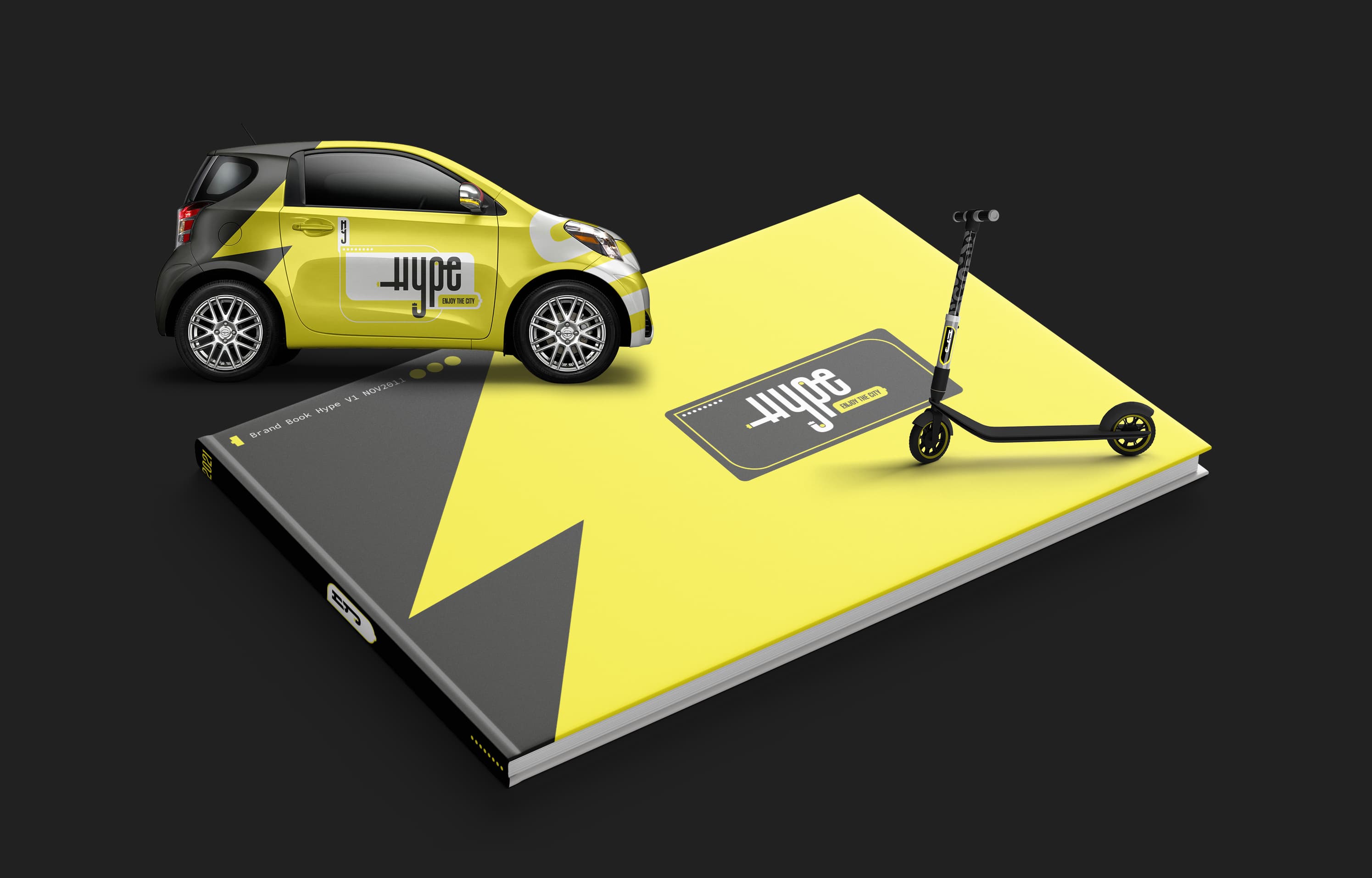
Academic concept project. Hype does not represent an operating company or commercial launch.
Next case · Bread&CoCredits
- Concept, art direction and complete development
- Jorge Millán Serrano
- Educational context
- Master’s in Art Direction · Trazos, Madrid
Visual project by Jorge Millán Serrano. Third-party mockups and base resources retain their original licences.
