Rebranding
Bread&Co
Identity redesign for a bakery with an artisan soul and a contemporary outlook.
- Date and location
- Madrid · 2022
- Discipline
- Branding
- Brand
- Bread&Co.
- Authorship
- Complete project · Jorge Millán
The Case
Some brands do not need an entirely new skin. They need refinement.
Bread&Co already had a recognisable foundation, a story and a personality linked to artisan bread. Its visual identity needed an update: more intent, more consistency and a presence that could connect with a contemporary aesthetic without losing its origins.
The work was about guiding that transition. We wanted a clearer way to express what the brand already was: a bakery rooted in craft, honest products and an identity ready to grow.
Tension
Refresh the brand without losing the recognition it had built.
Decision
Keep the blue and build a typographic system with more character.
Evidencia
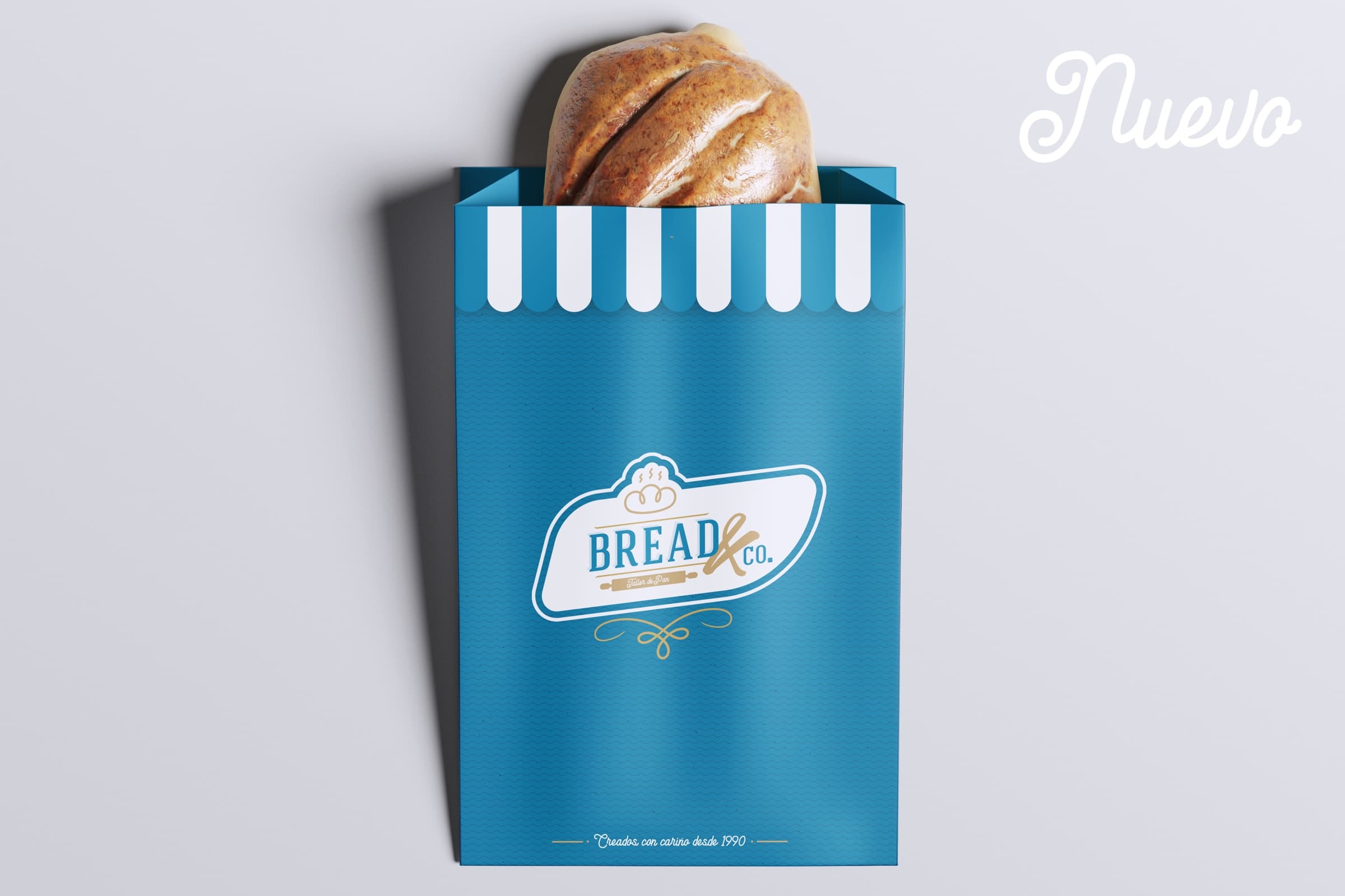
Variants, a compact combination mark and applications demonstrate the system’s flexibility.
BeforeAfter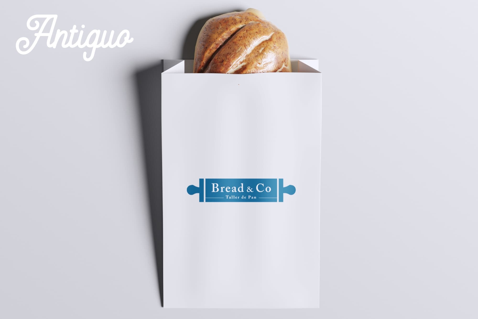
The challenge
Evolve without forgetting where you come from
The brief was direct but demanding. The client wanted a refreshed logo retaining the corporate blue, with a typographic solution incorporating a distinctive detail. The new identity needed to feel more current while still conveying craft, warmth and authenticity.
Beyond replacing a logo, the aim was to reposition the brand visually: preserve recognition, respect its heritage and open a new aesthetic horizon that better expressed the craft, bakery workshop and carefully made product.

Evolution does not mean forgetting your identity.
Creative direction
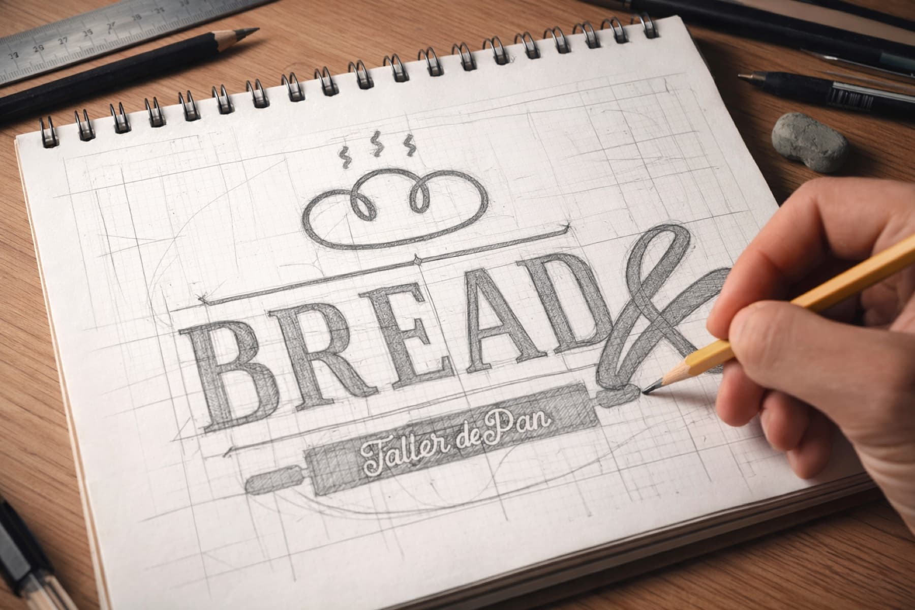
From handmade to timeless
The whole project revolves around a resolved tension: craft and contemporary design.
Craft brings truth, detail, humanity and skill. Contemporary design brings clarity, legibility and adaptability. The new identity emerges at that intersection: clear roots expressed through a cleaner, more versatile and current visual language.
The aim was to build a system with its own personality, ready for shopfronts, packaging, posters, digital environments and social media, rather than make the bakery look fashionable.
The visual system
A colour system that matures
The corporate blue had to stay, and we turned that constraint into a strength. It became an anchor for recognition and continuity: conveying calm and permanence, and symbolically connecting with water, an essential ingredient in sourdough.
Alongside it we introduced warmer, more natural tones. Gold recalls toasted crust and handwork in the bakery; neutrals add clarity and room for the identity to breathe.
- Craft blue#00769F
- Fresh blue#03ADC8
- Crust gold#BC9B66
- Human accent#E5446D
Blue for brand memory. Warm tones for the oven, crust and craft.
A visual voice with quiet character
The typography needed to balance presence with approachability. We wanted a recognisable brand without excessive ornament: rooted in tradition and open to contemporary use.
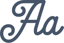
The primary typography was custom-developed with Cheddar Gothic Sans as a reference. Anelka Fambuya adds a warm, expressive counterpoint, while Billion Dreams is reserved for atmospheric and experiential uses.

Cheddar Gothic Sans
Primary · Foundation of the primary lettering
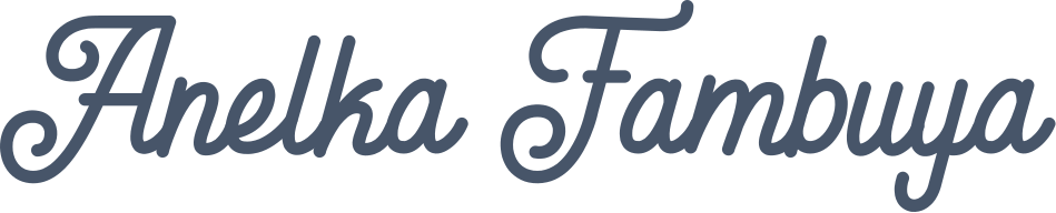
Anelka Fambuya
Secondary · Secondary artisan voice

Billion Dreams
Atmospheric · Atmospheric resource


An identity ready to live
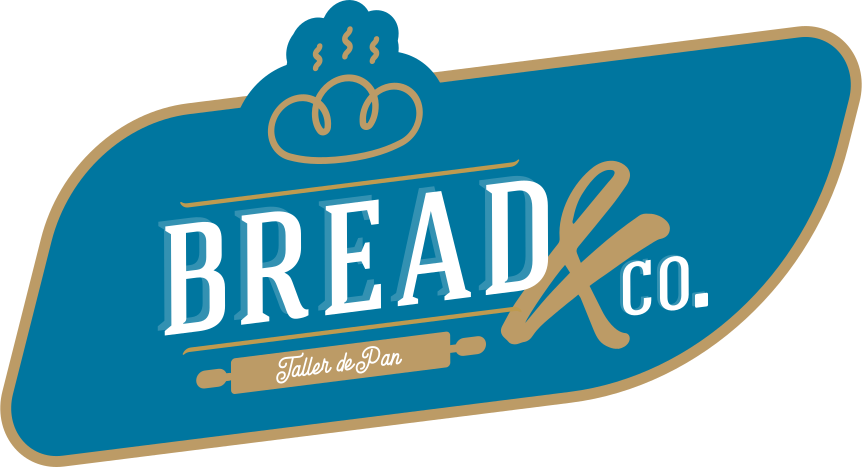
The new logo starts from a synthesis: preserve recognition and elevate the brand with elements that add personality and flexibility.
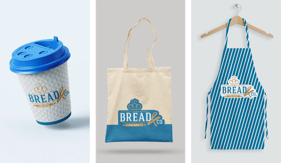
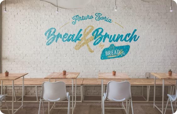
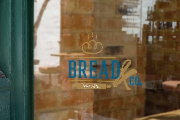
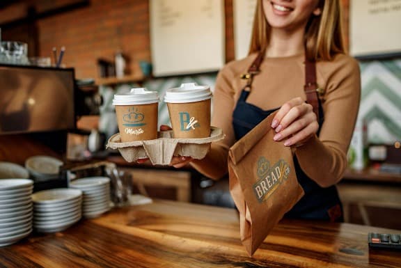
The redesign pursues clarity rather than artifice. That lets it work across sizes, media and contexts, from a shopfront to a coffee cup or social application.
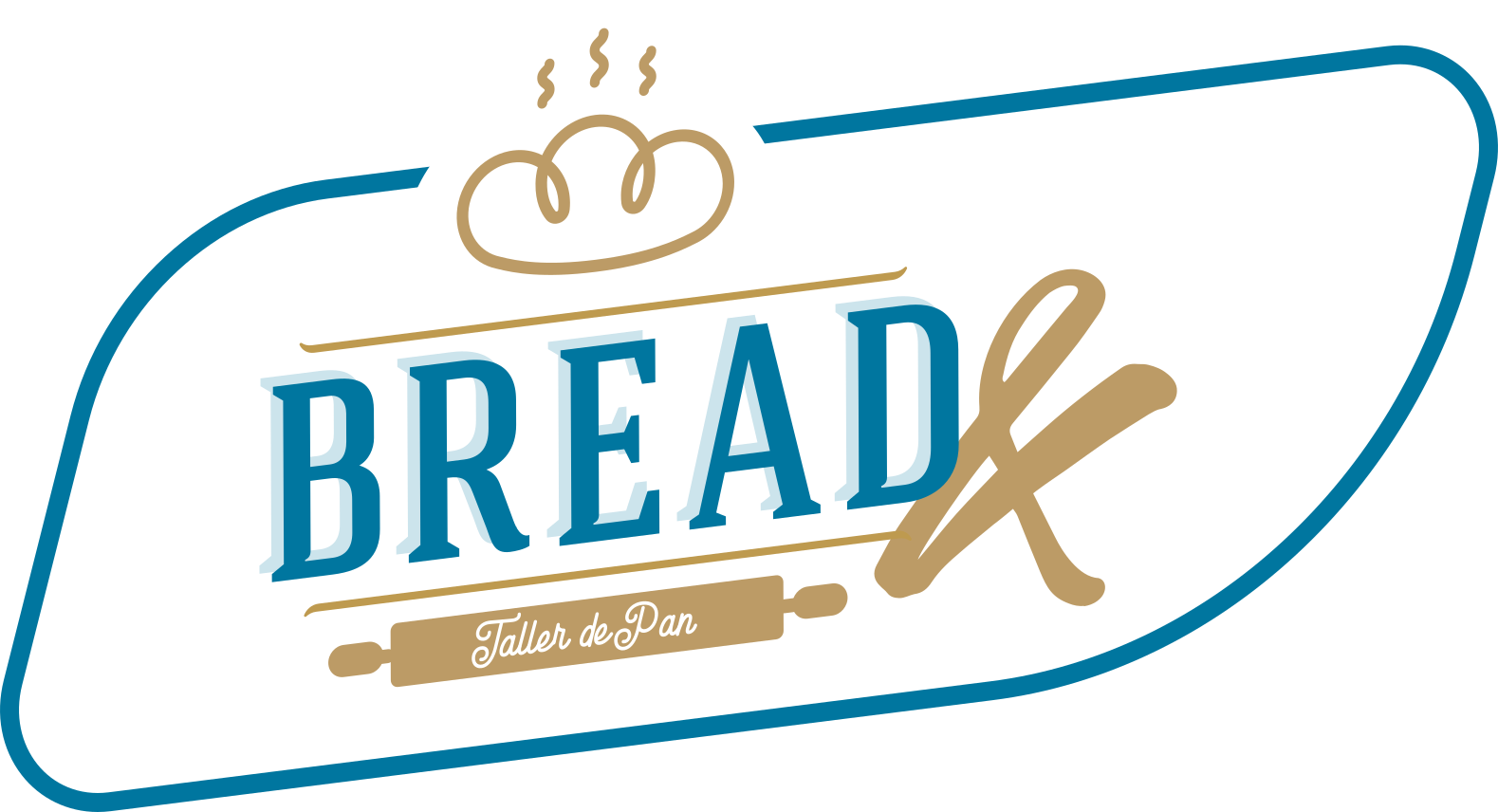
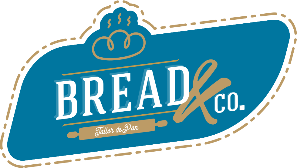
The system includes variants, a combination mark and compact assets for digital environments. It is a family that adapts without losing its voice.
A logo should look good and work well at every brand touchpoint.
The brand in use
The outcome
A more current brand that is still Bread&Co
The project’s value is a visible evolution that remains true to the original essence.
Bread&Co gains a cleaner, more mature identity ready for growth. Blue remains, craft is still present and the link with the bakery continues; everything is now expressed with greater intent, coherence and versatility.
- Recognition preserved
- Blue and the brand’s visual memory remain anchors of continuity.
- An expanded system
- The logo, variants, combination mark and favicon address different scales and media.
- Demonstrable application
- The identity is tested across packaging, uniform, point of sale and digital formats.
Explore more projects to see how I bring the same standards to brand, product and growth challenges.
View more projectsCredits
- Concept, strategy and complete development
- Jorge Millán
Author and rights holder of the identity project. Third-party presentation resources retain their original licences.
